An In Depth Look Into: Georgetown Peabody Public Library
User-friendly Design that Drives Library Patronage
Download Our Case Study
Georgetown Peabody’s website features clear, easy-to understand navigation elements and design components.
“The team at Libby were wonderful to work with. We were so impressed by how responsive they were to any requests or concerns we had while they were designing our new library website. We are constantly receiving compliments on our website! I would highly recommend them.”
-Sarah Cognata, Director
Georgetown Peabody Public Library came to us for a new website as their old one lacked an engaging design and user- friendly page. With the help of our team, we were able to provide a trend- setting website, which showcases their needs in an engaging and inviting presentation. Here are some examples of what we added to improve their website and increase their library patronage:
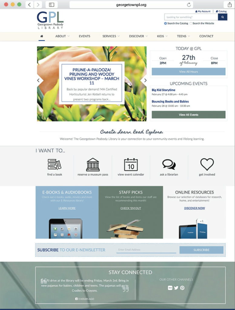
We customized their home page. In order to make their website more up to date with today’s technology, we used different techniques to give their website a contemporary twist. We used an image slider, which is an animated section with a slider of images, which circulates the latest news and happenings of the library. We then added a “Today” section, which updates daily to reflect the current day’s date and hours of operations along with an events section underneath.
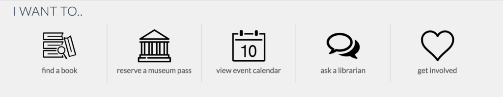
We made an “I Want To” Section. One of the most important qualities in a library website is having an easy to use search tool, as many patrons are looking for a specific title or event. With this section, we featured specific resources like “find a book” and “reserve a museum pass” to give patrons a friendly and easy to use icon list for different actions. We also put an e- newsletter bar in the bottom to give patrons the option to subscribe to the library’s emails and a social media section.
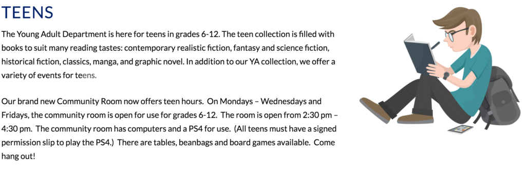
We chose to emphasize students and children. In some cases, families have difficulties affording resources that teachers deem necessary for achieving a proper education. As a result, many students and parents look to libraries as a more affordable place to find and use materials. Because students are a majority of a libraries patronage, we set up pages specifically for kids and teens. Each page showcases the curated sections with information relevant to its specific audience such as: Quick Links, pertinent news, recommended book lists, upcoming events, and featured resources.
We focused on organization and responsiveness. Each library is looking for something different. Georgetown Peabody wanted us to reflect their unique organization skills and responsiveness on their website, so that’s what we did. We used shades of blues, creams, grays, and greens, which further represents calmness and clarity to prove to its patrons its skills. We then used a stacked layout with this mobile-first responsive design elements, this allows content to resize for better readability and usability performance on a mobile device.
Download Our Case Study
Georgetown Peabody’s website features clear, easy-to understand navigation elements and design components.